Week 5's assignment was the one I spent the least time on out of everything so far — and yet, it was also the one I was most determined to do right.
In week 4, I had leaned heavily on AI, and as a result I felt a sharp discomfort: I had lost control over my own code. That feeling snowballed into a loss of confidence and a general dissatisfaction with what I had produced.
Feeling like AI was doing my assignments for me led to a deeper question about the whole point of being in the program.

I'm paying over 100,000 won a week for this program, and here I am letting AI do my assignments. What on earth am I doing?
The moment that thought hit me, I made a firm decision: the remaining six weeks would never go like that again. I started thinking hard about how to get 100% — or 200% — out of the Hanghae Plus experience and truly make it my own.
Setting Assignment Goals — Starting with the Right Mindset
Before diving in, I wrote down my goals for the week in a docs folder. It felt like taking an oath — something I carved into my mind before starting.
🤖 AI Usage Strategy

Use AI as a coding advisor: don't hand off all coding to AI; establish a clear division of roles
Clarify task split: distinguish what I do from what AI does, and proceed efficiently

📝 Documentation Improvement

Process-oriented writing: break the habit of conclusion-only writing and document the process as it unfolds
Step-by-step records: log the thinking and decision-making at each stage in detail

🎯 Learning Goals

Learn by doing: fully feel and understand what each assignment is meant to teach
Accumulate experience: gather insights and know-how from the actual refactoring process
Process-oriented learning: focus on learning through the process, not just whether the assignment passes
Read every other participant's code
1. AI Usage Strategy: I Control My Code
The core theme of this week was I control my code. I drew a clear line between what AI would handle and what I would handle, making sure that even while directing AI, I fully understood and owned every line of code myself. In design and implementation, AI played the role of "advisor" only — I wrote the actual code myself.
To pull this off, the first thing I needed was not to rush. When I'm in a hurry, I want quick visible results, and that's when "Hey AI, do this for me" comes out automatically.
I also recalled a conversation from a mentoring session with Teo. At work, with tight deadlines, I had a habit of diving straight into coding rather than thinking deeply and designing first. That's why it was always hard to write clean code or try new concepts under pressure.
Teo's answer was simple.
"Even now, without much time, you're studying, thinking, and trying to write clean code. You clearly have enough time. You need to feel that here."

That landed like a thunderbolt. So this week, even when I was pulling an all-nighter, I didn't lose my center. Instead of outsourcing to AI the moment things got urgent, I pushed through to the end with my own hands.
2. Documentation Improvement: Learn Through Process, Not Just Results
Over four weeks of Hanghae Plus, I noticed a habit of mine: I write in a "results-first" style, like a resume or a blog post. Thinking about why, I realized it's just how I'm wired. In school, I struggled with narrative-heavy subjects like history, but I excelled in math and science where input and output are clear — like a pure function. Once you understand the principle, solving the problem is easy.
Looking at other participants' posts, they brought their process to life with metaphors and wit. I admired and envied that. So this time, I decided to focus on process over outcome. As I worked on the assignment, I asked AI to summarize each commit, and recorded those summaries sequentially in the docs folder.
I'm going to try to write today's retrospective with that same process-oriented approach!
3. Reading Everyone Else's Code
One of the reasons I joined Hanghae Plus was to see how other frontend developers write code and learn from them. Yet for the past four weeks, I used "no time" as an excuse and never once properly looked at someone else's code.
After the reality check of week 4, I committed to the remaining six weeks with a "squeeze out every last drop" mindset — reading as much code as I could and leaving reviews.
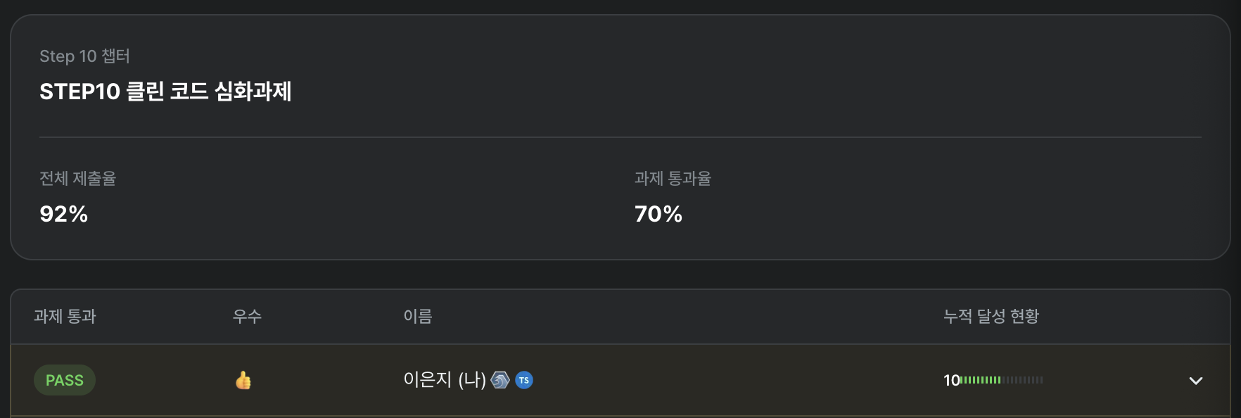
I left a lot more review comments than what's shown here, but I picked out the ones I felt were most meaningful. I couldn't read everyone's code, but I reviewed around seven participants' PRs including some I didn't leave comments on. The comment count alone was probably over 50!

Reading through those PRs gave me a glimpse into what each person was wrestling with.
"Oh, that's something I could think about too. I should try that in the next assignment." "They solved the same problem differently — so what are the trade-offs between their approach and mine?"
The review process pushed me beyond simply pointing out problems — I was able to articulate why something was a problem and how it could be improved. Reading comments others left on my own code also gave me practice in analyzing perspectives different from my own.
Things I Thought About and Tried
In this week's assignment, what mattered most wasn't the technical study itself, but the process of thinking about what "clean code" means to me, forming a definition, and actually putting it into practice. The things I focused on most:
- Building an optimized "kitchen" where I can chop and cook code right away
- How to build common components with high reusability and extensibility
- What logic belongs in
utils,models, andhooks, and how to implement each - How to organize features that span all domains
1. Building an Optimized Kitchen Where You Can Chop and Cook Code Right Away
At the start of the assignment, I used a basic role-based folder structure.
src/
├── components/   // Folder for reusable UI components
├── constants/    // Folder for constants and configuration values (e.g., calculation.ts)
├── pages/        // Folder for page components tied to routes
├── hooks/        // Folder for custom React hooks
├── utils/        // Folder for utility functions
├── types/        // Folder for TypeScript type definitions
└── App.tsx       // Root component of the application
I liked how each domain's util, constants, and type files were clearly namespaced, so I named them accordingly.
utils
- cart.util.ts
- product.util.ts

models
- cart.model.ts
- product.model.ts

types
- cart.type.ts
- product.type.ts

hooks
- useCart.ts
- useProduct.ts
But during a mentoring session with Coach Junil, I received unexpected feedback: "The travel distance is too long." With the current structure, modifying something like the cart feature required:
- Finding
CartItem.tsxin thecomponents/folder - Finding
useCart.tsin thehooks/folder - Finding
cart.util.tsin theutils/folder - Finding the related constant
cart.tsin theconstants/folder
Jumping between all those distant folders hurt development productivity. It felt like cooking a meal when your ingredients are scattered between the fridge, the pantry, and the attic.
So with "minimizing developer travel distance" as my goal, I first considered FSD (Feature-Sliced Design), but given its learning curve and the fact that I only had a day or two until the deadline, I went with the Feature-based structure I was already familiar with.
Top-level structure
src/advanced/
├── pages/           # Pages (HomePage, AdminPage)
├── features/        # Domain-specific feature modules
└── shared/          # Shared resources
Main feature domains
features/
├── admin/          # Admin features
├── cart/           # Shopping cart
├── coupon/         # Coupon system
├── discount/       # Discount handling
├── notification/   # Notifications
├── product/        # Product management
└── search/         # Search
Internal structure per feature
feature/
├── atoms/          # Jotai state management
├── components/     # UI components
├── hooks/          # Custom hooks
├── models/         # Business logic
├── types/          # Type definitions
├── constants/      # Constants
├── data/           # Initial data
└── utils/          # Utilities
Shared resources
shared/
├── components/     # Shared UI (icons, layout, ui)
├── constants/      # Shared constants
├── hooks/          # Shared hooks
├── utils/          # Shared utilities
└── errors/         # Error handling
After restructuring the folders this way, I immediately felt the reduced travel distance — when modifying any feature, I could stay within that feature's folder. Each feature also maintains a consistent internal folder structure, so whenever a new domain or feature is added, I just add a folder at the feature level. Extensibility improved dramatically.
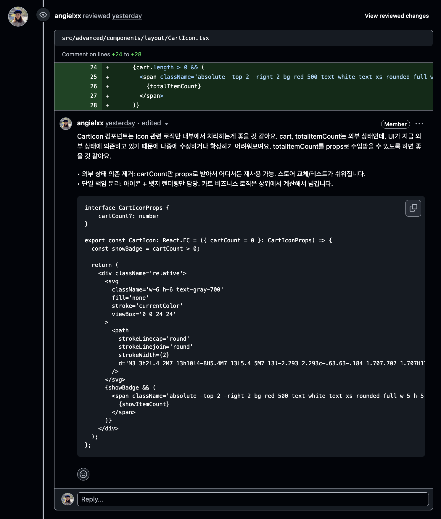
2. How to Build Common Components with High Reusability and Extensibility
Icon Component: Securing Extensibility with a Consistent Interface
I wanted to implement UI components like Icon in a flexible structure that could adapt to change. While building the Icon component, I noticed that all SVG icons shared a repetitive structure — even the outer svg tag was identical across all of them. Thinking "what's the simplest yet most effective approach?", I designed a main Icon component with a common interface, where each icon type only holds its own distinct path.
// Individual icon definitions
const PlusIcon = (props: IconProps) => <path />
const MinusIcon = (props: IconProps) => <path />
const CartIcon = (props: IconProps) => <path />

// Icon type mapping
const ICONS: Record<IconType, React.FC<IconProps>> = {
  cart: CartIcon,
  shop: ShopIcon,
  shopThin: ShopThin,
  minus: MinusIcon,
  image: ImageIcon,
  close: CloseIcon,
  plus: PlusIcon,
  trash: TrashIcon,
} as const;

// Main Icon component
const Icon: React.FC<IconProps> = ({
  size = 6,
  color = "text-gray-700",
  className = "",
  onClick,
  disabled = false,
  type = "cart",
}) => {
  const IconComponent = ICONS[type];

  return (
    <svg
      className={`${baseClasses} ${disabledClasses} ${interactiveClasses} ${color}`}
      fill="none"
      stroke="currentColor"
      viewBox="0 0 24 24"
      onClick={handleClick}
    >
      <IconComponent />
    </svg>
  );
};

// Usage
<Icon type="cart" size={5} />
Tabs Component: Maximizing Flexibility with the Compound Pattern
For components like Tabs and AdminSection, I implemented highly reusable components based on the compound pattern. I used the Context API to manage state and designed each sub-component to operate independently.
interface TabsContextType<T> {
  activeTab: T | null;
  setActiveTab: (tab: T) => void;
}

const TabsContext = createContext<TabsContextType<any> | null>(null);

const useTabsContext = () => {
  const context = useContext(TabsContext);
  if (!context) {
    throw new Error("useTabsContext must be used within a TabsProvider");
  }
  return context;
};

function Tabs<T>({ children, initialValue }: TabsProviderProps<T>) {
  const [activeTab, setActiveTab] = useState<T>(initialValue);

  return (
    <TabsContext.Provider value={{ activeTab, setActiveTab }}>
      {children}
    </TabsContext.Provider>
  );
}

const TabsList = ({ children }: PropsWithChildren) => {
  return (
    <div className="border-b border-gray-200 mb-6">
      <nav className="-mb-px flex space-x-8">{children}</nav>
    </div>
  );
};

// Trigger, Content components...

Tabs.List = TabsList;
Tabs.Trigger = TabsTrigger;
Tabs.Content = TabsContent;

export default Tabs;
At the usage site, it reads intuitively and declaratively:
<Tabs initialValue="products">
  <Tabs.List>
    <Tabs.Trigger value="products">Product Management</Tabs.Trigger>
    <Tabs.Trigger value="coupons">Coupon Management</Tabs.Trigger>
  </Tabs.List>
  <Tabs.Content value="products">
    <ProductAdmin />
  </Tabs.Content>
  <Tabs.Content value="coupons">
    <CouponAdmin />
  </Tabs.Content>
</Tabs>
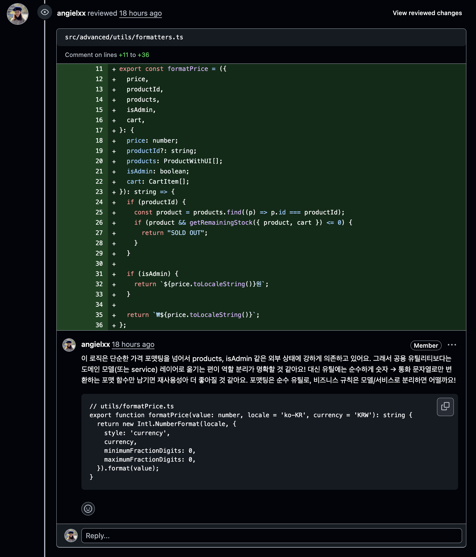
3. Separating utils, models, and hooks: Logic Split by Responsibility
To fully absorb what Teo wanted me to feel, I tried to follow the assignment closely. Reading through the hint folder he provided, hooks and utils felt familiar, but models was unfamiliar — I wasn't sure what kind of modules belonged there.
After studying through GPT, I summarized the difference between the three folders like this:
- hooks: State management and mutations that depend on React
- utils: General-purpose tool functions unrelated to any domain
- models: Pure business logic
Using this as a guide, when separating and refactoring functions, I distinguished what should go into utils versus models versus hooks.
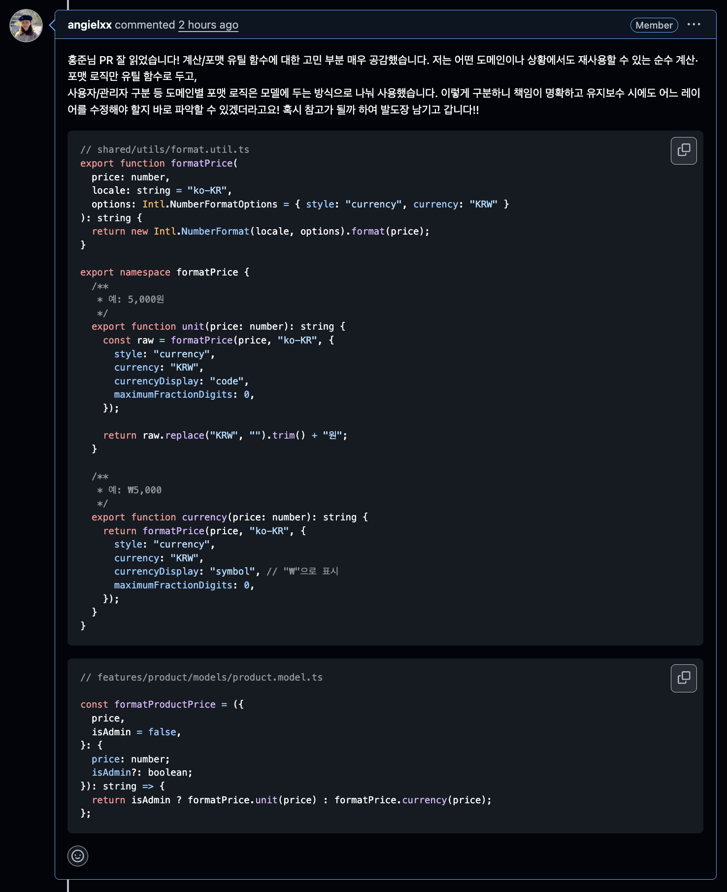
Real Refactoring Example: the formatPrice Function
Here's an example: there was a product price calculation function that originally received external state as input. I separated the pure utility logic from the business-related logic.
AS-IS: Tightly coupled logic
const formatPrice = (price: number, productId?: string): string => {
  if (productId) {
    const product = products.find((p) => p.id === productId);
    if (product && getRemainingStock(product) <= 0) {
      return "SOLD OUT";
    }
  }

  if (isAdmin) {
    return `${price.toLocaleString()}원`;
  }

  return `₩${price.toLocaleString()}`;
};
TO-BE: Layered split by responsibility
Utils layer: General-purpose price formatting unrelated to any domain
// src/basic/shared/utils/format.util.ts
export function formatPrice(
  price: number,
  locale: string = "ko-KR",
  options: Intl.NumberFormatOptions = { style: "currency", currency: "KRW" }
): string {
  return new Intl.NumberFormat(locale, options).format(price);
}

export namespace formatPrice {
  /**
   * e.g. 5,000원
   */
  export function unit(price: number): string {
    const raw = formatPrice(price, "ko-KR", {
      style: "currency",
      currency: "KRW",
      currencyDisplay: "code",
      maximumFractionDigits: 0,
    });

    return raw.replace("KRW", "").trim() + "원";
  }

  /**
   * e.g. ₩5,000
   */
  export function currency(price: number): string {
    return formatPrice(price, "ko-KR", {
      style: "currency",
      currency: "KRW",
      currencyDisplay: "symbol",
      maximumFractionDigits: 0,
    });
  }
}
Models layer: Business logic for the product domain
const formatProductPrice = ({
  price,
  isAdmin = false,
}: {
  price: number;
  isAdmin?: boolean;
}): string => {
  return isAdmin ? formatPrice.unit(price) : formatPrice.currency(price);
};

const getFormattedProductPrice = ({
  productId,
  products,
  cart,
  isAdmin,
}: {
  productId: string;
  products: ProductWithUI[];
  cart: CartItem[];
  isAdmin: boolean;
}): string => {
  const product = products.find((p) => p.id === productId);
  if (!product) {
    throw new Error("Product not found.");
  }

  const isSoldout = isProductSoldout({ productId, products, cart });
  if (isSoldout) {
    return "SOLD OUT";
  }

  const price = formatProductPrice({ price: product.price, isAdmin });
  return price;
};
With this separation, the responsibility of each layer became clear and testing got easier. utils are pure functions that guarantee identical results in any environment, while models encapsulate business rules and express domain knowledge in code.
4. Global Notification System: The NotificationBoundary Pattern
addNotification was used across every domain, which meant almost every component had to receive it as a prop. I started wondering: instead of handling notification dispatch at each individual call site, could there be a single external place that collects and handles them all?
The idea that came to me was: what if the places that trigger notifications just throw them as errors, and something external catches and handles them? That mental model led me straight to the Error Boundary pattern.
System Design
1. The NotificationError class
First, I extended the built-in Error class to create a custom NotificationError. I gave it a notification type as a property so it could carry that information, and set the name property to "NotificationError" to distinguish it from regular errors.
export class NotificationError extends Error {
  constructor(
    public message: string,
    public type: NotificationType
  ) {
    super(message);
    this.name = "NotificationError";
    this.type = type;
  }
}
2. The throwNotificationError utility
I extracted the logic that throws a custom NotificationError into a utility so the repetitive throwing code could be reused.
export const throwNotificationError: Record<
  NotificationType,
  (message: string) => never
> = {
  [NOTIFICATION.TYPES.ERROR]: (message: string): never => {
    throw new NotificationError(message, NOTIFICATION.TYPES.ERROR);
  },
  [NOTIFICATION.TYPES.SUCCESS]: (message: string): never => {
    throw new NotificationError(message, NOTIFICATION.TYPES.SUCCESS);
  },
  [NOTIFICATION.TYPES.WARNING]: (message: string): never => {
    throw new NotificationError(message, NOTIFICATION.TYPES.WARNING);
  },
} as const;
3. The NotificationBoundary component
The NotificationBoundary acts as the catch zone for these notification errors — it listens for error events via event listeners and handles notification errors there. The notification component itself is also rendered inside this boundary, so all notification-related logic is centralized in NotificationBoundary.
export function NotificationBoundary({ children }: PropsWithChildren) {
  const [notifications, setNotifications] = useState<Notification[]>([]);

  useEffect(() => {
    const handleUnhandledRejection = (event: PromiseRejectionEvent) => {
      if (event.reason instanceof NotificationError) {
        event.preventDefault();
        // ...add notification logic
        return;
      }
      throw event;
    };

    const handleGlobalError = (event: ErrorEvent) => {
      if (event.error instanceof NotificationError) {
        event.preventDefault();
        // ...add notification logic
        return;
      }
      throw event;
    };

    window.addEventListener("error", handleGlobalError);
    window.addEventListener("unhandledrejection", handleUnhandledRejection);

    return () => {
      window.removeEventListener("error", handleGlobalError);
      window.removeEventListener("unhandledrejection", handleUnhandledRejection);
    };
  }, []);

  return (
    <div>
      <div className="fixed top-20 right-4 z-50 space-y-2 max-w-sm">
        {notifications.map((notification) => (
          <NotificationItem
            key={notification.id}
            notification={notification}
            removeNotification={removeNotification}
          />
        ))}
      </div>
      {children}
    </div>
  );
}
Trade-offs of the Pattern
Pros:
- Can catch and handle both regular errors and notification errors distinctly
- All notification-related logic is centralized in
NotificationBoundary— clean separation of concerns - Simple to trigger notifications; easy to add new notification types
Cons: Since notification errors are still error types under the hood, throwing one halts the flow of execution at that point. Because of this, you can't throw a notification just anywhere — all necessary logic must complete first, and the notification can only be thrown at the very end.
Improvement Direction: Async Notification System
If I were to improve this approach, I could throw errors via Promise.reject() instead of throw, turning synchronous errors into asynchronous ones that don't interrupt the execution flow.
// Improved with Promise.reject
export const notifyAsync = {
  success: (message: string) => {
    Promise.reject(new NotificationError(message, "SUCCESS"));
    // Function exits normally here (no throw)
  },
};

// Usage
const handleSubmit = () => {
  updateData(); // Executes
  notifyAsync.success("Done!"); // Only calls Promise.reject, then continues
  saveToStorage(); // Executes!
};
When Promise.reject() is called and the rejected promise goes uncaught, the browser fires an unhandledrejection event — which NotificationBoundary can listen for and catch.
Designing and implementing something I came up with myself was genuinely fun!
Wrapping Up: KPT Retrospective
This assignment taught me a lot. Let me wrap it up with a quick KPT retrospective.
Keep (What Went Well)
Setting assignment goals and documenting them. Writing down clear goals before starting and recording them in the docs folder was a huge help. It kept me from losing direction during the assignment, and it's been a great reference for writing this retrospective.
Regulating AI dependency. Writing and controlling the code myself with minimal AI involvement. This let me reclaim ownership of the code and gave me a clear understanding of the intent and context behind each implementation decision.
Active engagement with other participants. After finishing my assignment, reading other participants' code and leaving reviews. This exposed me to diverse approaches and helped me develop a more objective eye for my own code.
Process-oriented thinking. Making a conscious effort to focus on the process rather than the outcome. This made it possible to clearly document what I learned and what I thought through at each step.
Problem (What Didn't Go Well)
Starting the assignment too late. Getting a late start meant I couldn't secure enough time. I missed opportunities for deeper exploration and more varied experiments.
Execution falling short of the plan. I had a solid plan, but time management in practice was disappointing. Especially for documentation and test writing, I didn't invest as much time as I'd planned.
Try (What to Attempt Next Time)
Better weekly planning. On the Friday after submitting an assignment, don't just rest — use that time to prepare for the next one. Getting things like reading other people's code, writing WIL (Weekly I Learned), and outlining the next week's plan done in advance will let me focus more fully on the actual assignment work.
Adopt an incremental improvement approach. Instead of trying to build the perfect structure all at once, try improving in small increments. This way, even under time pressure, I can keep making steady progress on code quality.
Apply new learnings immediately. Take patterns or concepts I've just learned and apply them in the next assignment right away. Implementing something in practice, rather than just knowing it in theory, is what makes it truly stick.
Cultivate a code review culture. Exchange code reviews more actively with other participants. This is not only mutually beneficial for growth, but also a great opportunity to learn from a variety of perspectives.

Wrapping up my WIL on Sunday evening… and once again, WIL has stolen my Sunday away from the week 6 assignment. Sigh. I guess it's time to get started.
But this assignment gave me so much. I was able to form my own definition of what "good code" looks like, internalize how to collaborate with AI on my own terms, and figure out how to grow alongside my peers.
For week 6, I'll go in more self-directed and more proactive. And I'll keep the good habits I built this week going. The real value of Hanghae Plus isn't in completing assignments — it's in the growth and insight gained through the process. This week made that crystal clear.
Let's go, week 6!
+ I received a Best Practice award!