Starting the Series
I went through three team projects at Samsung Youth Software Academy (SSAFY, 삼성 청년 소프트웨어 아카데미) and built a design system from scratch — including dark mode implementation — in two of those projects. A bit of context: SSAFY doesn't have dedicated designers, so it naturally falls on the frontend engineers to handle UI/UX design. Since I have a design background and some hands-on industry experience, I ended up owning both UI/UX design and frontend development across all my projects.
Coming from a design background, I was naturally drawn to the intersection of design and frontend engineering. Implementing dark mode was one of my personal project goals, so from the very start I researched how to set up a design system that supports dark mode and how to translate it into code. I actually designed the entire design system in Figma and then brought it to life in code!
Who This Is For
This series is written for frontend developers who, like me, have a strong interest in UI/UX or find themselves in a position where they need to design a system themselves — for instance, frontend developers at SSAFY handling design work on top of engineering.
The series is planned as three parts:
- Design system theory needed to implement dark mode
- Building a design system for dark mode
- Implementing dark mode using the design system
Prerequisites
If you're new to design systems, I'd recommend reading the article above first. It will give you a solid understanding of what a design system is and why it matters.
If you want to see real-world examples of design systems, this link lets you browse publicly available Figma design systems from various brands. (It's a fun rabbit hole to explore.)
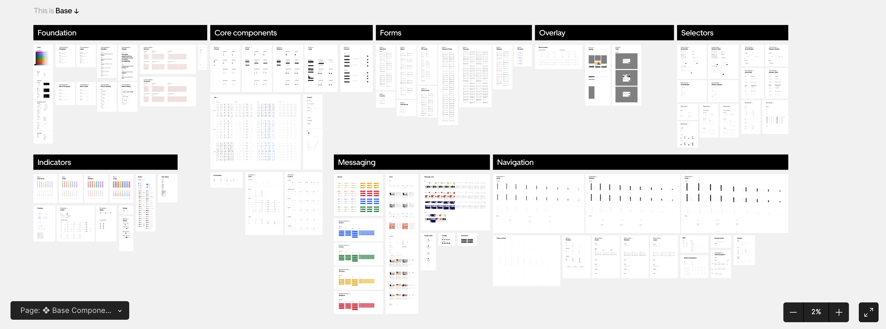
Uber's Design System
Why Dark Mode Matters
Dark mode has many advantages, but the three most prominent are:
- Reduced eye strain
- Improved visibility and readability
- Energy savings
Beyond these benefits, dark mode also enhances the overall user experience — users can choose the theme that works best for them and apply it to the application.
Core Theory of Dark Mode
This section was heavily inspired by SOCAR's blog post Dark Mode — Double Down on Your Design System! (Part 1).
To implement dark mode properly, the two major reference points in the design system world are Apple's Human Interface Guidelines (HIG) and Google's Material Design. Both are legendary in the UI/UX field and worth knowing well.

Google's Material Design provides more detailed guidance on dark mode than Apple's HIG. If you want to go deeper, check out the link below:
https://m2.material.io/design/color/dark-theme.html
To save you some time, here are the key concepts distilled from these guidelines.
1) Use a Semantic Color System
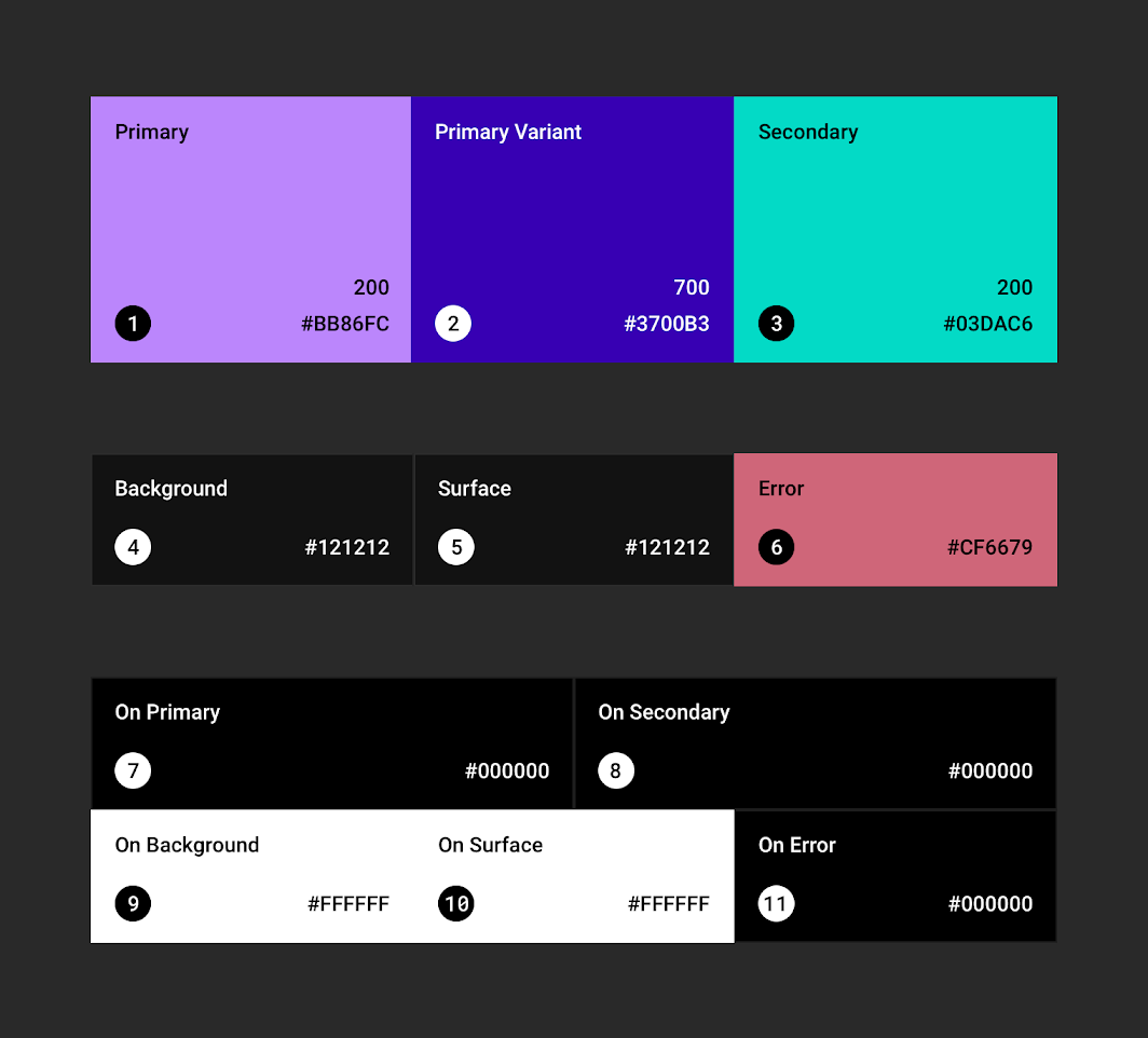
A semantic color system means naming each color according to its intended purpose and organizing them into a system. In the example above, colors are named by their role — Primary, Secondary, Background, and so on. In contrast, naming colors by their literal HEX values (e.g., #1A1A1A) would be a non-semantic approach.
With a semantic color system, each role (e.g., background) maps to a corresponding color value per theme — white in light mode, black in dark mode. It's also worth keeping in mind that colors in UI design aren't purely aesthetic; they communicate information hierarchy and meaning.
2) Higher Layers Use Lighter Surface Colors
In the default (light) theme, shadows convey elevation — how high a layer sits above the base surface. In dark mode, surface color takes on that role instead. This makes sense because shadows simply don't read well against dark backgrounds.
Material Design even specifies exact values for this:
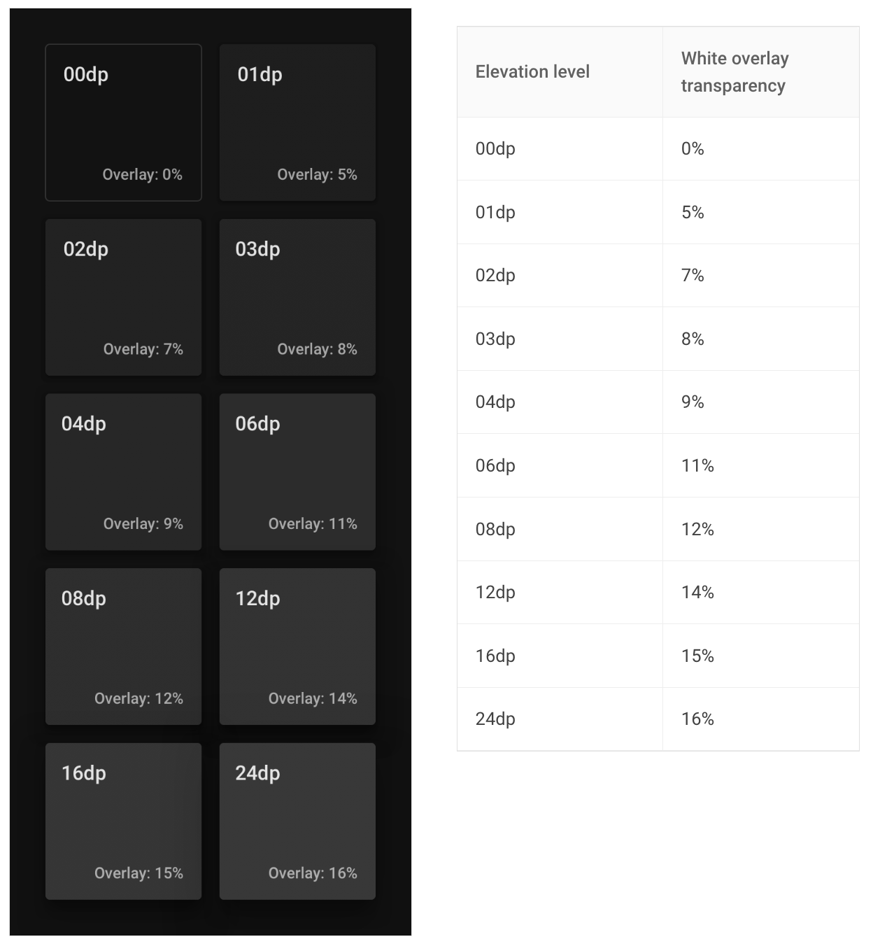
The diagram shows ten distinct elevation levels, each with a prescribed opacity value for the overlay. Rather than figuring this out from scratch, you can follow Material Design's system and define background colors by level — it works right out of the box.
3) Background Color
Apple's HIG and Google's Material Design take different approaches to background color in dark mode.

Material Design recommends using a dark gray rather than pure black as the base background. This allows for a wider range of colors and depth to be expressed, and it reduces the contrast between light text and the background, which in turn reduces eye strain.
HIG, on the other hand, recommends pure black as the background — to create sharp contrast between text and layered elements. The reasoning is specific to Apple hardware: a black background blends seamlessly with the iPhone's bezel, creating a unified feel between the device and the UI.
One Important Thing to Keep in Mind
Now that we've covered the core theory for building a design system, there's one last thing worth calling out:
Dark mode is not simply the inverse of the light mode color scheme!
I'll be honest — I did invert the light mode colors for my own implementation. I simply didn't have enough time to fine-tune the dark mode palette with the care it deserved. But just know that inverting your light mode color system doesn't automatically preserve the same level of readability you had in light mode.
SOCAR's example:
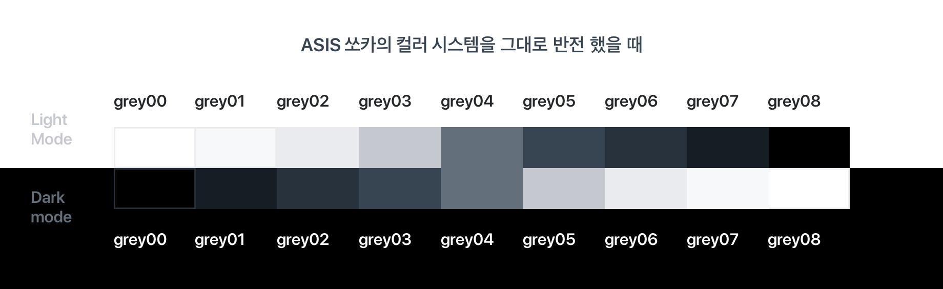
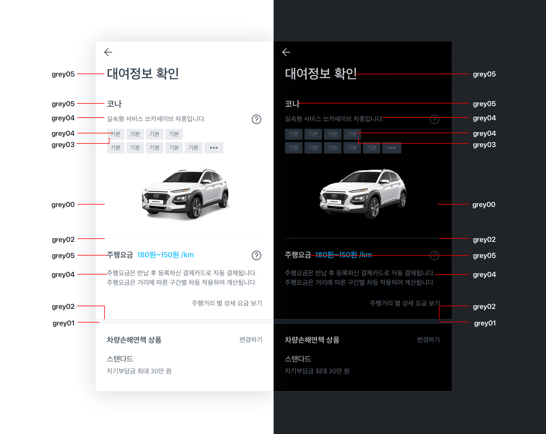
You can see that body text readability drops in the dark mode screen.
Given time constraints on the design side, I went with the inverted approach as a practical shortcut. But if you're a UI/UX designer or you want to push the polish of your design system further, I highly recommend taking the time to carefully calibrate your dark mode color palette.
That wraps up the theoretical groundwork for building a design system and implementing dark mode!
In the next post, I'll walk through the actual design system I used in my project and show you step by step how I put it together.
References
https://tech.socarcorp.kr/design/2020/07/10/dark-mode-01.html
https://blog.wishket.com/다크모드-ui-디자인의-원칙/
https://m2.material.io/design/color/dark-theme.html#behavior
https://developer.apple.com/design/human-interface-guidelines/dark-mode